
First, we had to convert their current direction and bring it into a modern era.

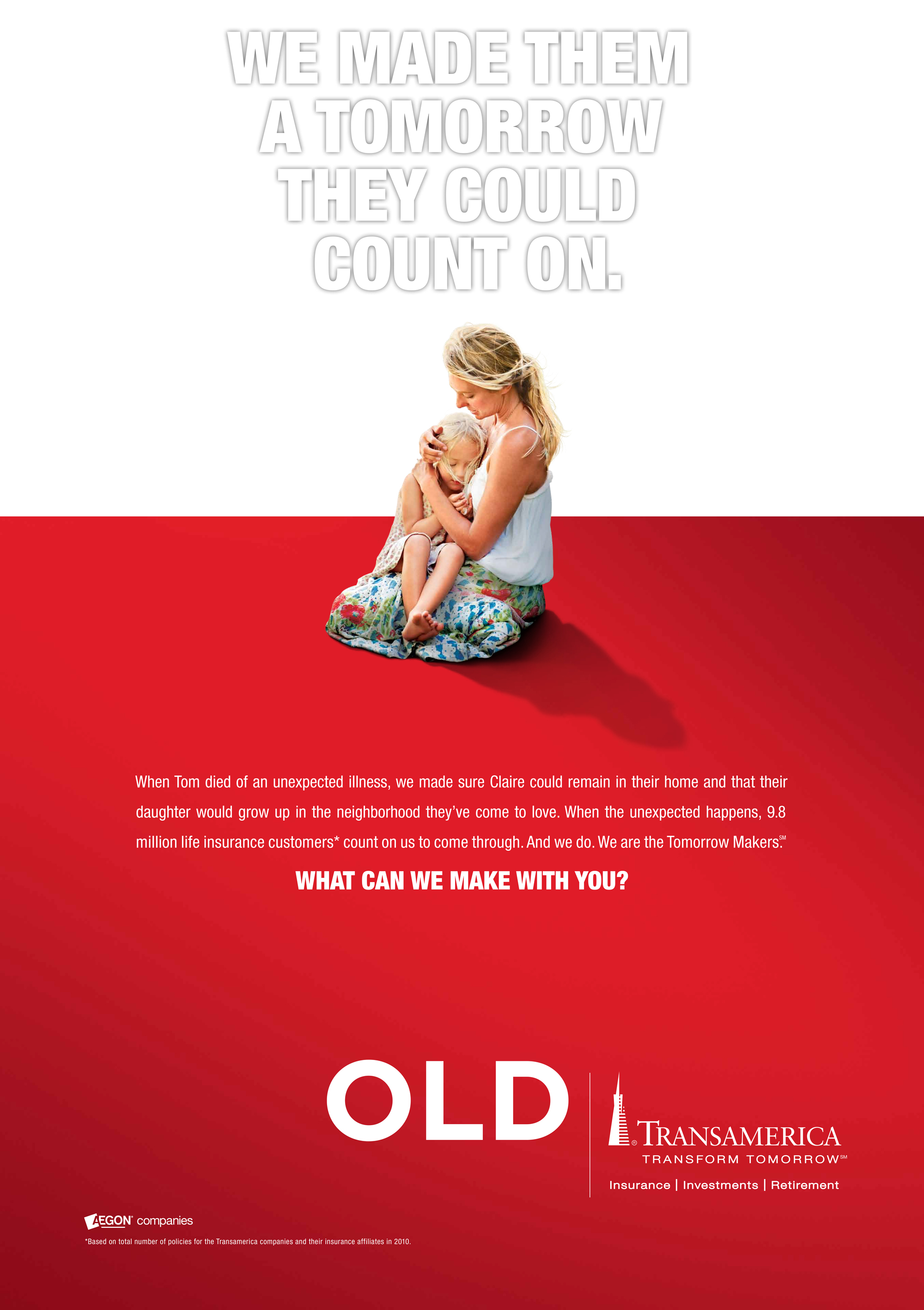
We took their initial print ad of the woman holding her child, and renovated it to show a modern woman who can take care of the finances and be a part of the decision-making in the house, not just appear to be a victim.
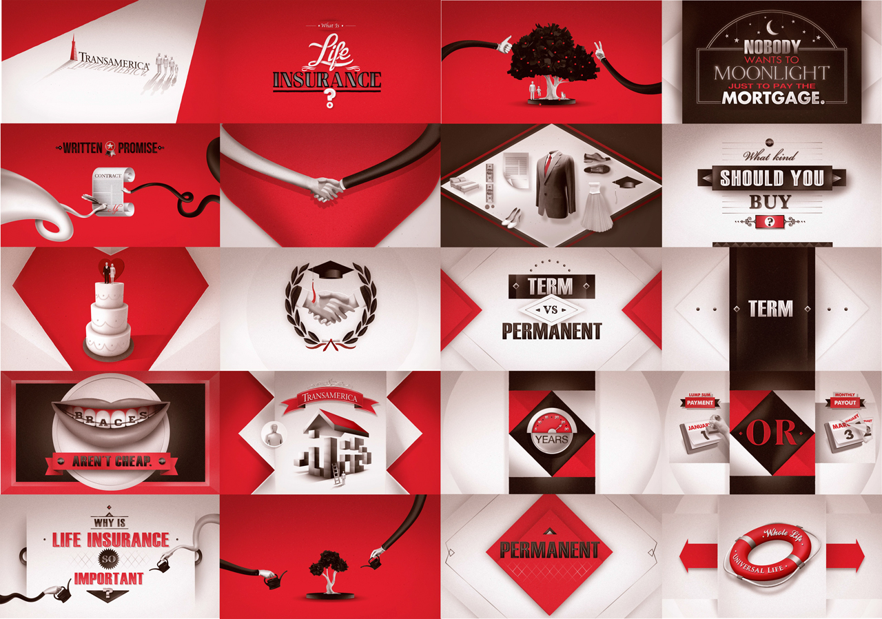
Once we gained their confidence, it was our turn to really show what we do by using their iconic pyramid as a symbol of how Transamerica is a gateway to your family's future.
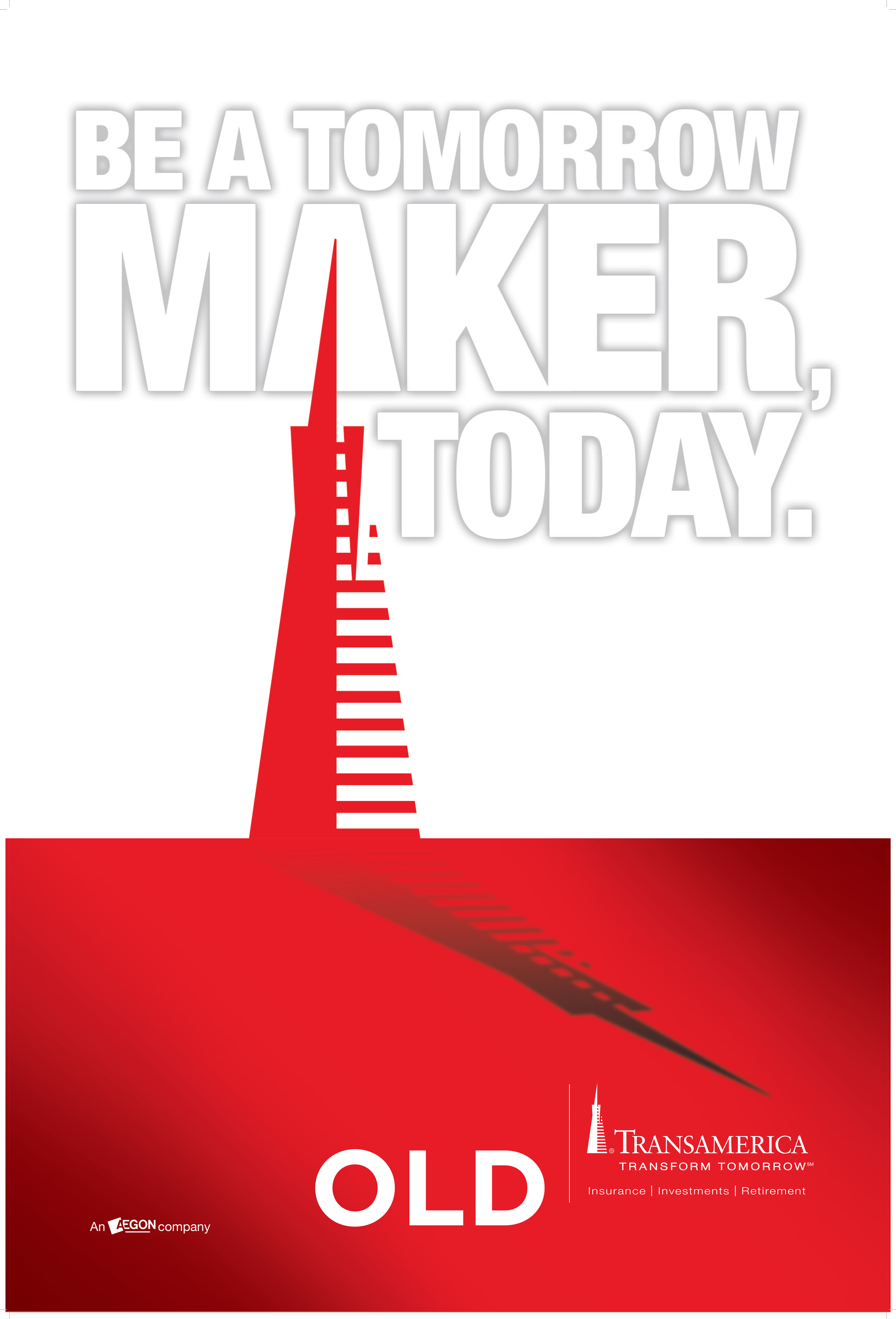

The Transamerica building in San Francisco is their most recognizable and revered symbol in the company's history. So what I did was create a visual that shows this symbolic building as a literal curtain to a better future.
Next they wanted to create a new brand extension to attract a young demographic to buy Life Insurance, but how do you get people to buy life insurance when they never think about death? You call it what it really is...Death insurance.
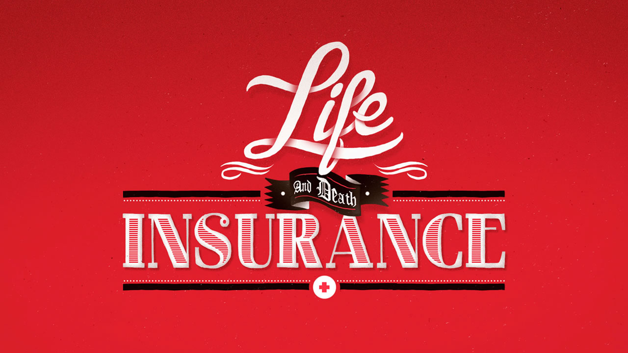

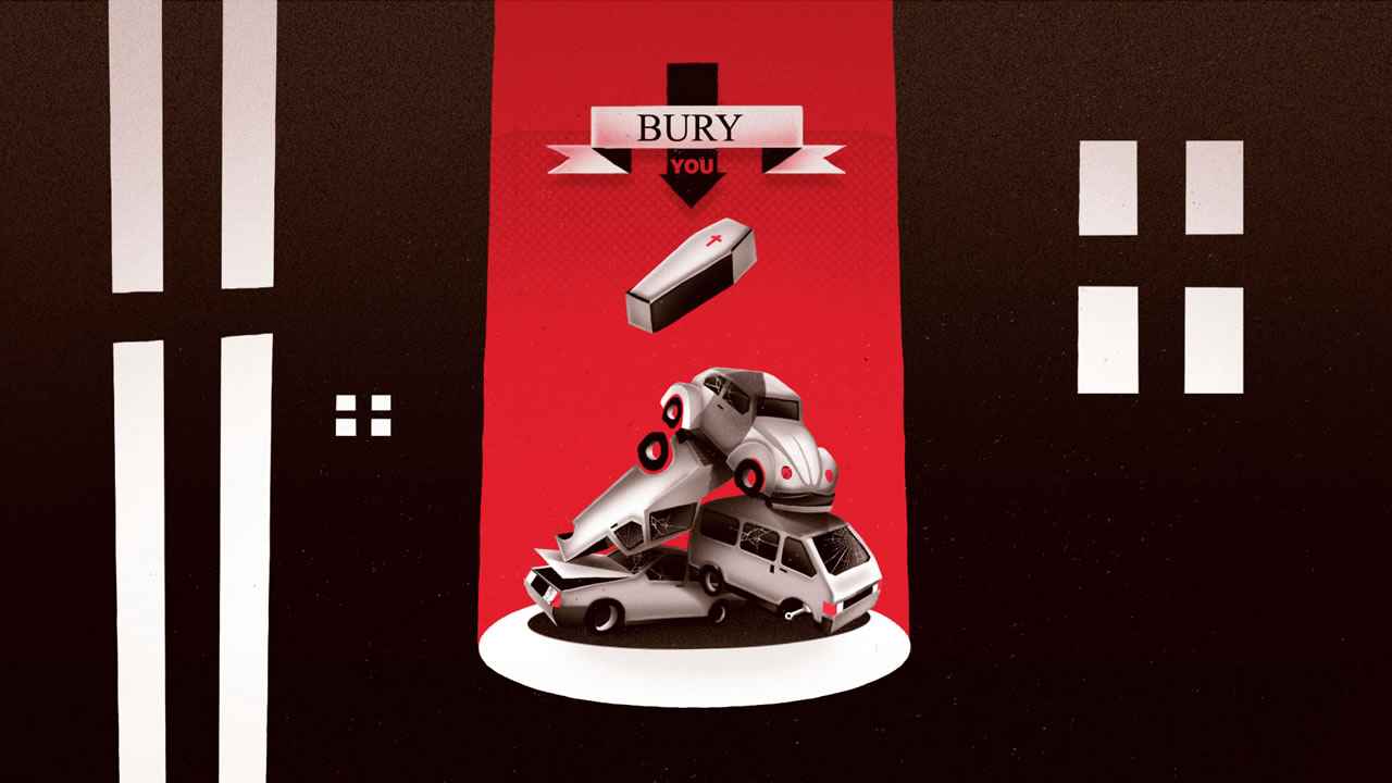
I worked with an amazing production house out of Chile, Loica, to make these stunning boards that really have a fun, but morbid feeling so that the overall message is understood.
Once we got some client/internal feedback, the messaging was watered down, but the animations still came out looking beautiful.